Every retail space tells a story, but the most successful ones quietly direct the action. From the moment a customer steps over the threshold, your physical layout silently controls where they look, where they linger, and, ultimately, what ends up at the checkout.
Far from being a simple exercise in aesthetics, a strategic retail store floor plan is one of your most powerful commercial assets. By combining spatial psychology, intelligent lighting, visual sightlines, and high-impact point-of-sale positioning, you can turn passive browsing into an effortless, high-converting customer journey.
Whether you are launching a new high-street flagship or optimising an existing footprint, here is how Limeblue leverages spatial design to boost dwell time, elevate brand engagement, and maximise your average transaction value.
Why Retail Store Floor Plans Matter to the Bottom Line
Customers experience a shop as a sequence of moments, rather than a static collection of fixtures. They enter, orientate themselves, notice particular products, move towards areas that interest them, browse, compare options, ask questions, and eventually approach the checkout.
Every one of those moments presents an opportunity to remove friction or create engagement, both of which encourage purchasing.
Research into retail environments increasingly treats footfall, dwell time, and movement as measurable aspects of commercial performance. For example, a study by Pathintelligence found that shoppers buy more when they stay longer, with a 1% increase in dwell time resulting in a 1.3% increase in sales.
That is why good retail store floor plans should not simply fit everything into the available footprint. They should be designed around how customers actually move through a space, and support the behaviour that retailers want to encourage.
The objective of such psychological retail design is not to make customers feel manipulated. It is to make the journey feel effortless, intuitive, and rewarding.
Benefits of an Effective Floor Plan
A commercially effective in-store layout can help to:
- Make the store easier to navigate.
- Increase exposure to priority products.
- Encourage customers to explore more of your space.
- Create comfortable areas for consideration and consultation.
- Reduce bottlenecks around busy fixtures.
- Give premium products the space and attention they deserve.
- Make promotional and impulse purchases feel more natural.
- Create a smoother route towards checkout.
Understanding Customer Flow in Retail
Customer flow in retail describes how shoppers move through a physical store, including the routes they naturally take, the areas where they slow down, and the points where they stop or turn around.
Some retailers instinctively understand their customers’ movement patterns, but making assumptions can lead to errors. After all, a beautifully designed store can still contain dead zones, congested areas, or poorly positioned displays that customers simply overlook.
This is where spatial planning becomes particularly valuable. Before deciding where a fixture should go, it helps to ask:
- What should customers notice immediately?
- Where do they naturally move after entering?
- Which products need extended consideration?
- Where are the likely pause points?
- Which areas receive the highest footfall?
- Where might customers feel crowded or confused?
- What should they encounter immediately before reaching the till?
The answers create a behavioural map that can then inform the physical design.
Importantly, customer flow in retail is not about forcing every shopper to follow exactly the same route. Different customers have different missions. A regular customer may want to find a familiar product quickly, while a first-time visitor may be happy to explore. The best layouts accommodate both.
Using Psychological Retail Design to Guide Customer Journeys
The First Few Metres: Designing the Decompression Zone
One of the most overlooked elements of retail store floor plans is the entrance.
Customers need a moment to transition from the street, shopping centre, or car park into the retail environment. Immediately filling this area with promotional messaging, fixtures, or products can create visual overload.
Instead, the entrance should be a decompression zone. This space should be designed to control what the customer sees first, create an intuitive visual hierarchy, and allow enough room for people to enter without immediately colliding with displays or other shoppers.
This principle is central to psychological retail design, because research shows that perception happens before conscious analysis, meaning that customers form an impression of quality, accessibility, value, and relevance within moments of entering.
A strong entrance will answer three questions quickly:
- Where am I?
- What does this store offer?
- Where should I go next?
Once customers are oriented, the layout can begin to introduce them to the brand story and products.
Encouraging Exploration Using Sight Lines
Humans are naturally drawn towards visual cues, contrast, movement, and areas of interest. Retail designers can use this instinct to create sight lines that encourage exploration.
For example, a customer entering a fashion store might immediately see a strong seasonal display positioned further into the space. Rather than stopping at the entrance, they have a reason to move towards it.
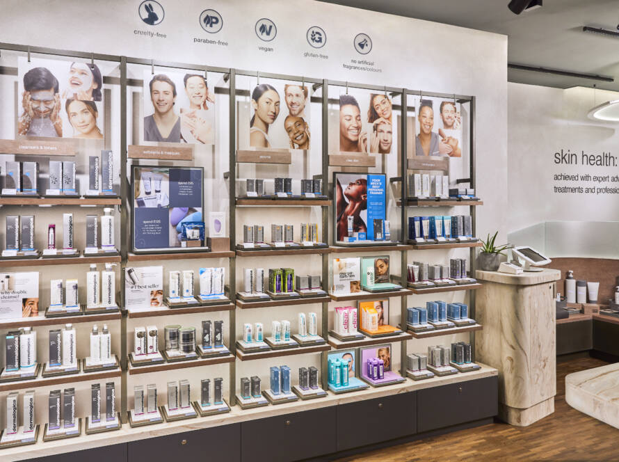
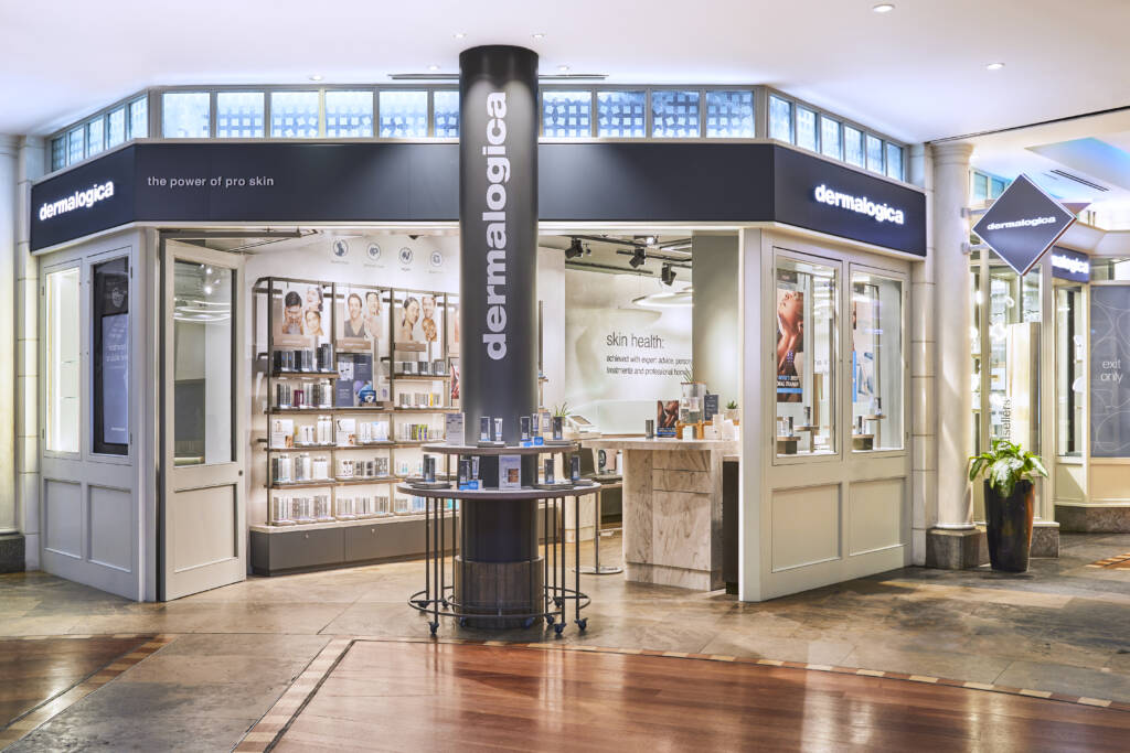
Likewise, a skincare retailer might use a consultation area as a visual destination, subtly communicating that the store offers expertise as well as products. This was the case with our design for the Dermalogica Duke of York store in Chelsea, where interactive Skin Bars and open treatment areas transition into retail zones.
This is psychological retail design in practice. The objective is to create visual invitations rather than barriers.
Consider using:
- Hero displays at strategic points.
- Contrasting materials to identify destinations.
- Lighting to highlight priority zones.
- Low-level fixtures where longer sight lines are important.
- Vertical displays to create visual landmarks.
- Branded graphics to reinforce orientation.
The result should feel natural, allowing customers to discover the journey themselves rather than feeling that they are being directed through a maze.
Lighting as a Behavioural Tool
Lighting can change how a space feels, but its role goes beyond ambience.
A brighter area can draw attention to a particular display, while softer, more focused illumination can help create a sense of intimacy around premium products or consultation zones. The contrast between areas can also help customers understand where they should look or move next.
For retailers, the opportunity lies in aligning lighting with the intended behaviour of each zone.
| Retail Zone | Potential Lighting Approach | Customer Objective |
| Entrance | Clear, welcoming illumination | Orientate and invite |
| Hero display | Focused accent lighting | Capture attention |
| Product browsing | Consistent, comfortable lighting | Encourage exploration |
| Consultation area | Softer, flattering illumination | Support conversation |
| Premium zone | Layered, atmospheric lighting | Create perceived value |
| Checkout | Clear, functional lighting | Make purchasing easy |
Good lighting should always work alongside merchandising and architecture. Spotlights cannot compensate for a confusing layout, just as thoughtful retail store floor plans cannot perform at their best if key products disappear into poorly lit corners.
At Limeblue, we consider lighting as part of the wider spatial experience rather than a decorative afterthought. The same principle applies across our work, whether we are creating retail environments, exhibitions, or other commercial spaces.
Strategic Zoning: Giving Every Area a Job
One of the most effective ways to improve customer flow in retail is to divide the store into purposeful zones.
Think about the store as a sequence rather than a single room. You might have an introduction zone, a discovery zone, a product comparison area, a consultation zone, and a transaction area. The exact combination will depend on the brand, product category, footprint, and customer journey.
For example, in Dermalogica’s Belfast flagship store, Limeblue developed strategic zoning to balance open retail space with private areas, creating a journey from product discovery towards consultation and professional treatment. The completed environment incorporated four consultation areas and two dedicated treatment zones.
This demonstrates why zoning should reflect the commercial proposition. If a retailer sells expertise, experience, or services alongside products, the layout needs to give those elements sufficient physical presence.
The same thinking can be applied to fashion, beauty, furniture, technology, hospitality-led retail, and many other sectors.
The Psychology of Product Placement
Once the broad circulation route is established, product placement can reinforce it.
High-demand products do not always need to occupy the most prominent position. In some retail categories, placing frequently sought-after products deeper within the store can increase exposure to other ranges along the way. Conversely, convenience-led stores may prioritise speed and accessibility.
This is why psychological retail design must start with an understanding of the customer mission and associated types of purchasing.
Consider the difference between:
- A destination purchase, where the customer knows exactly what they want and values speed, clarity, and easy access.
- A discovery purchase, when the customer is open to inspiration, comparison, and recommendations.
- An experience-led purchase, when the customer expects consultation, demonstration, or interaction before buying.
- An impulse purchase, when the customer is influenced to pick up additional products from displays at the checkout.
Each requires a different approach to retail store floor plans. The strongest layouts recognise all of these behaviours rather than imposing one generic circulation model across every retail format.
Signage, Graphics, and Visual Navigation
Even the most intelligent floor plan can become difficult to use if customers cannot understand where they are.
Signage and environmental graphics provide an additional layer of navigation. They can identify departments, reinforce brand personality, communicate product benefits, and help customers make decisions without always needing staff assistance.
This is particularly important in larger stores, complex units, and spaces with multiple zones.
Good retail graphics should:
- Be visible from appropriate distances.
- Use clear hierarchy and concise messaging.
- Support, rather than compete with, merchandise.
- Reflect the wider brand identity.
- Help customers understand what happens next.
In this sense, graphics become part of the architecture of the customer journey.
At Limeblue, we see spatial design, graphics, lighting, and physical detailing as connected disciplines. Our exhibition and museum projects similarly use graphics and visual storytelling to guide visitors through spaces, demonstrating how environmental communication can influence movement and engagement.
Point of Sale Positioning: More Than a Checkout
Point of sale positioning is often treated as the final step in a store layout, but it deserves consideration from the beginning.
The checkout is simultaneously a transaction point, a customer service touchpoint, a queue-management challenge, and a final merchandising opportunity. Its location should support the customer journey without creating unnecessary congestion.
Depending on the store format, placing the till too close to the entrance can shorten the browsing journey, while positioning it deeper within the store may encourage greater product exposure.
However, there is no universal rule. Instead, effective point of sale positioning should consider:
- Store geometry.
- Visibility from key areas.
- Queue capacity.
- Staff sight lines.
- Convenience.
- Accessibility.
- Safety requirements.
- Customer privacy.
- Impulse merchandising.
- Bagging and collection space.
- Integration with digital payment.
- Security requirements.
The checkout should feel like the natural conclusion to the journey, not an obstacle placed at the end of it.
A Practical Checklist for Reviewing Your Retail Layout
If you are considering a refurbishment, relocation, or simple store refresh, start by reviewing the customer journey objectively.
Ask yourself:
- Can a first-time visitor understand the store within seconds?
- Is the entrance welcoming rather than visually overwhelming?
- Are key product categories easy to find?
- Can customers see meaningful destinations from where they enter?
- Are there obvious dead zones?
- Do fixtures create unnecessary bottlenecks?
- Does lighting distinguish priority products and zones?
- Is there somewhere comfortable to pause or consult?
- Does signage support navigation?
- Is the checkout easy to locate without dominating the entrance?
- Does point of sale positioning support both service and merchandising?
- Can staff maintain good visibility across the space?
- Does the layout accommodate accessibility and safe movement?
- Are the back-of-house areas supporting efficient customer-facing operations?
A joined-up approach matters because every square metre of space has a job to perform.
At Limeblue, our design process considers the complete footprint, including customer-facing areas and back-of-house functions. Our retail interiors specifically focuses on optimising floor plans and operational areas while creating strategic product placement that encourages interaction and dwell time.
Designing Retail Store Floor Plans That Make Your Space Work Harder
A retail environment should be beautiful, but beauty alone does not pay the rent. The strongest retail interiors combine creativity with clear spatial logic. They understand that a customer’s route through a store can influence what they see, how they feel, what they consider, and when they purchase.
That is the real value of psychological retail design. It is about understanding human behaviour and using space intelligently to create an intuitive journey that can lead to more productive dwell time, stronger product visibility, improved customer experience, and potentially higher transaction values.
For Limeblue, this is where design becomes genuinely strategic. With more than 30 years of experience creating inspirational commercial environments, we combine the personal approach of a boutique agency with the technical expertise required to take projects from initial concept through to installation.
If you are reviewing your retail store floor plans, planning a new unit, or considering how your existing space could work harder, contact us to discuss your project. We can help you turn your floor plan into a customer journey that looks exceptional, feels effortless, and supports your commercial ambitions.
FAQs About Psychological Retail Design
Q: How often should a retail store layout be reviewed or refreshed?
A: A retail layout should be reviewed whenever customer behaviour, product ranges, trading objectives, or operational requirements change, with a more formal review often useful annually. Major refurbishments or changes in brand strategy are also good opportunities to reassess the entire customer journey.
Q: Can psychological layout principles be applied to small or narrow high-street retail units?
A: Absolutely. Smaller stores can benefit significantly from clear sight lines, carefully controlled fixture heights, strong zoning, lighting, and vertical merchandising. The challenge is to make every square metre work without making the space feel crowded.
Q: How do building regulations and accessibility compliance impact customer flow design?
A: Building regulations, fire safety requirements, and accessibility considerations can influence circulation widths, escape routes, entrances, fixtures, and occupancy. These requirements should be integrated into the design from the outset rather than treated as an afterthought.
Q: What is the difference between foot traffic heatmapping and customer flow in retail?
A: Customer flow is the planned or observed movement of people through a retail environment, while heatmapping is a data-led method of visualising where people actually move, stop, or concentrate. Used together, they can reveal whether the intended layout is producing the desired behaviour.
Q: How do you balance open retail spaces with security and loss prevention?
A: Good design can combine openness with security through appropriate fixture heights, clear sight lines, staff positioning, technology, mirrors, and carefully considered product zoning. The aim is to protect merchandise while maintaining a welcoming environment for customers.